In the last post you saw Casa Lleo Morera, an example of “classic” Modernista. This time you’ll see a very different Modernista style that’s just one house away from Casa Morera. Casa Batlló is one of Antoni Gaudí’s masterpieces, a symphony of shape, color and light. Although it was built in 1904, it looks avant garde even today. We loved it! You’ll see in this post (and subsequent posts, culminating in Sagrada Familia) why Gaudí is considered a genius. You saw the outside of this house in the first Barcelona post, so below are just a few exterior pictures to refresh your memory. Fascinating, yes? The allure of the facade is reflected in its many interpretations. The principle one is that Gaudí


was referencing the city’s patron saint, St. George killing the dragon. Look at the last picture in the set above; the roof is the dragon’s back (is that triangular window on the right its eye?), the tower on the left is St. George’s lance, the balconies are the skulls of the dragon’s victims, and the columns of the lower windows (previous picture) are their bones. The other main interpretation is that the whole facade is an allegory of Carnival; the roof is a harlequin’s hat, the balconies are ball masks, and the mosaics on the wall represent falling confetti. A mark of a great work of art is the controversy it creates, but hey, I know a dragon’s back when I see one!
The story of Casa Batlló is that the industrialist Josep Batlló owned a conventional building at this site (left-most picture below) but wanted a house that stood out; he wanted something audacious and  creative. So he hired Gaudí based on the architect’s incredible Park Guell (wait ’till you see that in a subsequent post!). He gave Gaudí free rein to do whatever he wanted. Although Batlló wanted to tear down his existing plain house, Gaudí convinced him that a renovation was sufficient. I think we can agree that the resulting renovated building is indeed “audacious and creative”. So let me show you the interior, where audacious and creative continues! Fasten seat belts. You should notice during the tour that there are few straight lines or square floors in Gaudí’s house. “Undulating” is probably the best description of every surface – including walls and ceilings!
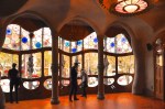
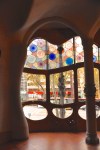
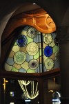
The entrance hall leads to stairs and a central well that extends to the roof and is covered


by a vented skylight. Gaudí was always interested in making his houses very livable, and he used very inventive ways to increase light and ventilation. In his renovation he expanded the central well to deliver more natural light to the surrounding rooms. He wanted more light, but he also wanted to deliver uniform lighting to the various floors. In order to do this, he made the windows smaller at the top (where the light is strongest) and sequentially larger on each floor going down (see first picture below). He also made the glazed tiles darker at the top and lighter at the bottom where they would reflect more


light (see next picture), again helping to achieve a uniform brightness on the different floors. The color gradient and the light gradient combine to give an almost uniform color appearance to the central well, as shown in the last picture. That picture also shows attached structures beneath the windows, which are vent slats to provide fresh air to the house. Vents are everywhere in Casa Batlló – they’re present on windows, doors and even walls, as shown in the examples below. Impressive attention to detail, yes? The central well is also simply beautiful on its own, as shown in that last picture.


OK, back to the house tour! The building consists of a ground floor, a main floor with a courtyard, four other self-contained floors, a loft and a roof terrace. The entrance hall leads to the ground floor, shown below. The two oval skylights in the first picture are


said to resemble tortoise shells. In the second picture, notice the curving wall and “bug-eyed” windows, and the amazing door. Different, but the other half of the room is simply a new world. The astonishing wood staircase resembles the curving spine of some huge


animal. Further, that curving spine defines the end of the wall! There is a separate wave of a wall behind it, disappearing up the stairs. The walls are almost in motion, with subtle patterns of color superimposed over polygonal shapes that refer back to the tortoise shell skylights. The baseboard molding is wave-like, as is the staircase spine itself. Descriptions of this room talk of “an underwater atmosphere”, with the wall having the colors and shades of the surface of the sea and sand. It is the world of Jules Verne. There is a feeling of being magically inside a wave.
The staircase leads to an elegant and exciting landing on the main floor. The curving walls, gorgeous wood and large oval windows (eyes? portholes?) are awesome (pictures


from the internet). In the opposite direction is a hall, but we’ll continue forward through the major doorway.
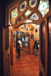
The curving walls in this next room have the same polygonal pattern as the ground floor, but the colors are no longer of the sea; they’re a warm brown. Note that the window shown in the first two pictures below is not planar; the wood frame curves into the room.


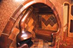
There are some surprising details in this room – that mirror/cabinet, for example – but the most notable feature is the cozy, secluded, intimate fireplace alcove that can accommodate just a few people. As we exit this room through a beautiful three dimensional door – the last picture above – notice the door visible behind it!
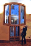
The next room has one of those “boney” windows overlooking the Passeig de Gracia, shown below. The window and its wood surround are amazing. Vying for attention is this


particularly beautiful 3-dimensional door leading into the next room. Not only is it a 3-D door, it’s amazingly a 3-D folding door! Designing that to fit properly sounds challenging! Like doors and windows in other areas of the house, this organically shaped oak beauty is topped by a header with inset panes of patterned stained glass; it’s also shown (first picture below) from the other side. This door, and another on the opposite side of the middle room, can fold back to create a single light-filled space out of the three rooms.


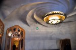
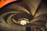
Before going into that major middle room, let me give you a wider view of these two rooms from a picture I borrowed from the internet, shown above. Together, this main suite of rooms is an exciting, light-filled space with wide wall-to-wall and floor-to-ceiling-high views of Barcelona’s most fashionable street. I would call it a reverse shop-window display, flaunting its location. Then, walking into that central room … well; the windows aren’t the only items of interest! The ceiling is a veritable whirlpool; a wavy allusion to the


sea? I should remind you that Gaudí renovated this house in 1904; most houses look dated after 100 years. I think you’ll agree – not this one.
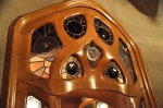
Details from other rooms are shown below.


The main floor also contains a courtyard, which is accessed from the room shown below. The room has an interesting ceiling (second picture) – perhaps representing a drop of fluid landing in a pool? This room also has a number of inventive references to the sea.


The door to the courtyard is almost blocked by columns; a barrier between sea and land? The courtyard itself is a little disappointing; it’s attractive enough, but it’s close to normal

 courtyard")

in a house that, everyplace else, is anything but!
The loft of this house is also unusual, with sixty arches that create a space resembling the rib cage of an animal – perhaps the rib cage of the dragon whose backbone arches over the
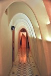

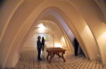
roof? The loft was originally a service area for the upstairs tenants, containing laundry rooms and storage areas. It’s beautiful in its simplicity of form and all-pervading light.
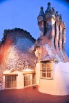
And now the interesting roof! The roof terrace is one of the more popular features of the house due to its famous dragon design. The arch of the roof resembles the spine of a dragon, a perception enhanced by the ceramic roof tiles that suggest reptilian skin. The


tiles have a metallic sheen to simulate the varying scales of the beast, with the color grading from green on the right side to deep blue and violet in the center, and then going to red and pink on the left side. Alas, in the failing light, I can’t capture how vibrant it is. The roof also has four sets of sinuous and beautifully tiled chimneys that suggest bunches of mushrooms. They’re absolutely beautiful, with gorgeous patterns; but they’re also very
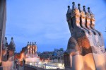
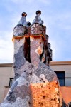

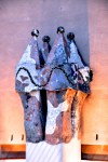


functional, designed to keep smoke from blowing back down the chimney.
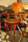
Gaudí was a control guy, not unlike Charles Rennie Mackintosh in Glasgow, the subject of an earlier blog (Glasgow I, The City). In addition to designing the building, Gaudí also designed furniture for it; and as you might imagine, it’s also pretty fabulous! Some examples were on display.


We’ll end this post with a walk back to the main floor – night is falling fast. That room is
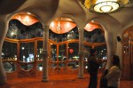
pretty again, in a new light.
So we end the tour of this fascinating house! It was built in 1904, and today I think it’s still ahead of its time. It is truly weird – and compelling, and beautiful, and captivating. Inventiveness is absolutely everywhere, and masterfully done. We’d live there in a minute! If this was your introduction to Gaudí, you’re in for a treat – we’ll be doing two more posts featuring him, including our final Barcelona post on his amazing and almost finished cathedral, the Sagrada Familia.


Next post – let’s do a short one; just one building, basically just one room. It’s the Catalan  Concert Hall. We’ll call it Barcelona IV: Palau de la Musica Catalana. Here’s a preview. Don’t miss it!
