Amsterdam’s Rijksmuseum, III

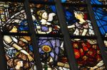
OK OK, I’ve shown a bunch already, but there is so much more wonderful to see at Amsterdam’s Rijksmuseum.  This last (promise!) post on the Rijksmuseum is mostly on the Impressionists, and Henri Matisse in particular; the museum had a special exhibit on his career, particularly his latter years, with paintings on loan from throughout the world.  It’s interesting to see his artistic development, so let’s start with him!

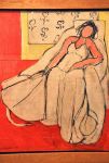
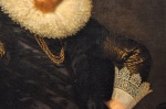
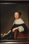
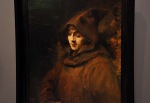
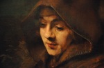
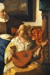
It’s 1895, and Matisse has an academic style – a mostly realistic representation of objects

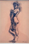
and a subtle, dark palette, as illustrated by the first two paintings above.  His studies of nudes are also classical, as shown in the last picture above.  However, Matisse has a ceaseless quest for innovation.  He becomes acquainted with Impressionism, and from an extended visit to the island Corsica and its Mediterranean light, his palette is transformed to bright colors.  He dabbles in the Pointillism of Seurat and Signac, then develops a new

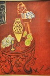
approach, creating areas of pure, super-saturated color, a style that came to be known as Fauvism, and of which Matisse was one of the main leaders.  As the art world entered into the modern times of Picasso and Cubism, Matisse begins to work in his characteristic “pure line”; he does countless studies of the female form, executed in a few seemingly

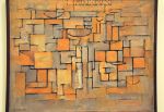
effortless lines, and produces paintings that reduce shapes to their most elementary forms.  During the horrors of WWI, Matisse returns to Paris and paints in highly abstract,

geometrically constructed works.  Commissioned to do stage and costume designs for a ballet, Matisse continues with his geometric patterns.  In search of the most effective compositions, he cuts shapes out of paper and arranges them in patterns; the process impresses him, and later in life he exclusively returns to this technique (as we’ll see!).

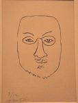
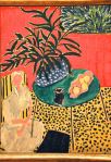
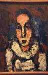
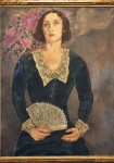
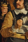
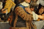
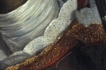
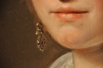
Following a trip to Morocco where he encountered the world of the odalisques (concubines or harem slaves, particularly in Turkey), Matisse features them in his paintings and returns to a more figurative, naturalistic style.   In his words, “I make odalisques so that I can paint nudes.”  Hmmm.  We’ve noticed this propensity!  Increasingly he incorporates

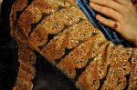
props and has his subjects pose in clothing made from expensive fabrics in order to create a dream-world of exotic women in seductive poses.  That last painting, you will notice, is a ringer from Picasso.  It’s a tribute to Matisse, done shortly after his death: “When Matisse died, he left his Odalisques to me.”

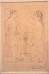
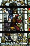
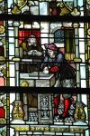
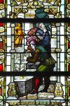
Below are charcoal/pencil sketches, one of his assistant Lydia Delectorskaya (who helped

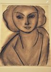
make many of the costumes for his models), one sketch from an envelope, and the other clearly a self-portrait (as you can see from the subsequent photo).

The last phase of Matisse’s explorations as a painter occurs following the German invasion of France and Matisse’s move to a reclusive life near the French Riviera.  He

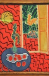
adopts a flat style with simplified lines and dazzling color.

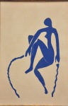
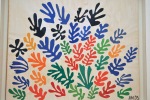
The most interesting part of the Matisse exhibit was his transition to cut-outs.  As noted earlier, his use of cut-outs in creating costume designs had intrigued him.  He further played with this technique in his design of Dance II, a triptych mural for the Barnes

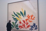
Foundation in Philadelphia (which we’ll show you in a future blog), and in his design for a cover for the journal Verve, a modernist Parisian art magazine.  Now, in the mid 1940’s, he sees this technique in an entirely new light, and he dedicates himself to it.  Matisse was one of the few Impressionists/Fauvists/Modernists who continued to innovate well into old age.  He was the first to employ cut-outs on a grand scale, and they are a vibrant grand finale to his life.   Some early – can we call them paintings? – are shown below.

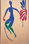
The transition from painting to cut-outs is actually rather seamless.  Check out the work below, Mimosa, and compare it to the fern in the painting Interior with Black Fern, the

last painting shown 3 panels earlier.

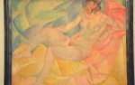
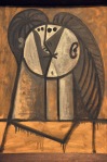
Matisse obviously loved the female form, and of course he goes back to his nudes, as

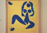
shown above.  Gradually his cut-outs expanded to a monumental scale, as shown below, although by now Matisse is 84 and in a wheelchair, needing an assistant to mount the

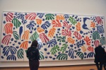
cut-outs.  That last work, The Parakeet and the Mermaid, Matisse says “I have made myself a little garden all around me where I can walk.”

This last piece, to the left, was done the year of his death (1954).  It’s again a design for the cover of the journal Verve; Matisse did a number of covers for them.  The Fauvist tendencies are still there, and still interesting.

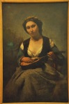
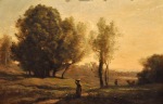
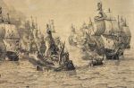
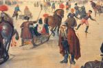
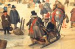
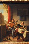
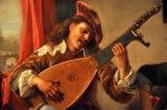
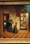
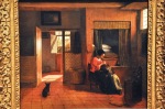
One of the delights of this exhibition on Matisse was the juxtaposition of his work with other artists of his time, allowing one to see how they influenced each other (such as the Picasso shown earlier).  Duplicating that exhibition in this post would be too much, but I will show you some of the paintings of these Impressionists and Modernists, which I’ll group not by artist but by year.  We’ll start, as did the exhibit, with paintings that predate Matisse.  They’re too good to miss!

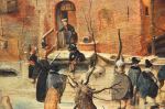
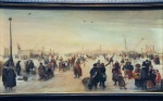
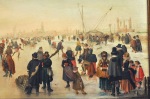
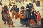
Here are a few early Impressionist paintings:

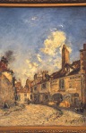
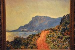
I really liked the picture by Jongkind, The House of Master Adam Billaud at Nevers.  I was not familiar with Jongkind; he’s regarded as a forerunner of Impressionism, a link between the works of Corot and Monet (and Monet was one of his pupils).

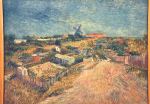
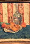
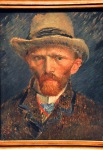
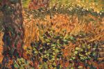
And here are some Van Gogh paintings (mind you, Amsterdam has a whole museum devoted to Van Gogh, so there are only a few Van Gogh paintings at the Rijksmuseum).

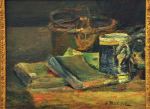
OK, just a few more pre-Matisse paintings:

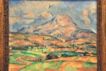
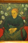
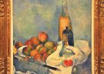
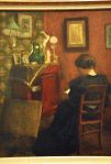
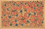
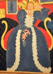
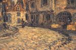
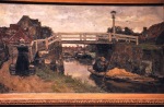
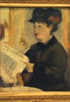
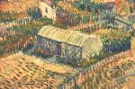
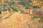
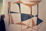
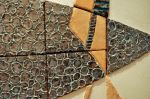
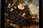
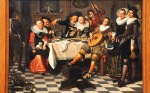
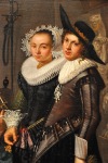
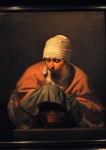
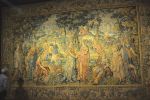
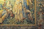
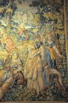
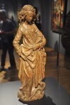
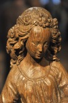
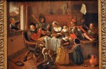
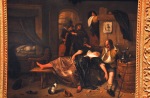
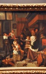
The following paintings are from Matisse contemporaries:
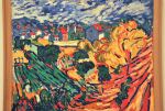
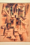
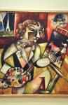
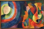
As are these:

I’ll end with a later, cute work by William Copley, Lady Chatterley’s Horse, from 1960.

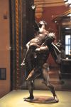
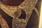
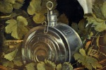
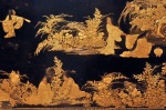
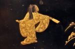
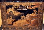
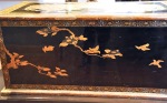
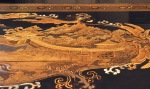
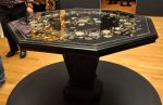
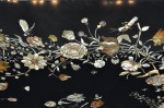
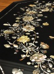
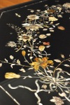
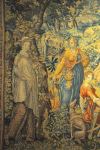
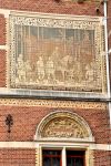
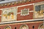
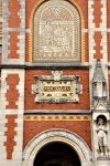
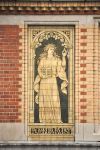
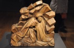
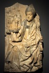
As noted in the previous post, there is more to the Rijksmuseum than paintings, and I’ll share a few more of these treasures with you.  The first, shown on the first line below, is an amazing folding screen called Guineafowl, made by G. W. Dijsselhof in 1894 from cotton batik (the technique involves drawing on cloth with wax; when dyed, the drawing is left uncolored).  Batik was the

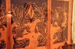
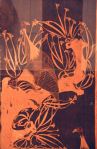
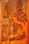
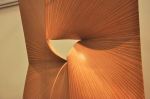
Dutch contribution to art nouveau.  Although reflections from the protecting glass made photography very difficult, I think you can still see how amazing this work is.  The two other wood items are beautiful in their own way.

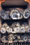
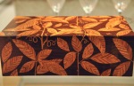
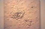
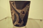
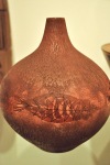
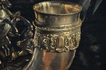
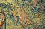
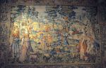
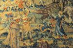
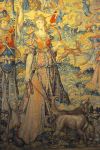
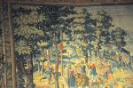
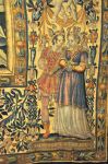
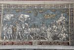
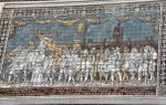
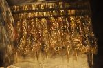
The fascinating items below are all ceramic.

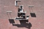
I’ll close with this work of art, shown below.  How interesting to find this allusion to

American politics in an Amsterdam museum!

Alas, I have a sad story to tell.  Also in Amsterdam is the Van Gogh museum, which we thought was truly fabulous.  I did not realize he only painted for 10 years (!).  His evolution from his first crude paintings (The Potato Eaters) to his subsequent style is remarkable.  We loved this museum, and I had some amazing pictures to show you.  Past tense.  They unfortunately got overwritten.  If you get to Amsterdam, don’t miss that museum.

Next post, Paris.

Amsterdam’s Rijksmuseum, II

This post is a continuation of the previous one, Amsterdam’s Rijksmuseum ILet’s start with another painting by the Bartholomeus van der Helst.  We saw him in the previous post; like Rembrandt, he was a leading portrait painter of the Dutch Golden Age.  In fact, although he and Rembrandt were contemporaries in Amsterdam, it was van der Helst who became the more popular portraitist in that city due to his flattering portrayals combined with Rembrandt’s drift towards more dark and introspective works.  This 1648 painting, Banquet at the Crossbowmen’s Guild in Celebration of the Treaty of Münster (marking an end to the war with Spain), is marvelous.  It captures the shadings of black, the reflections

on glass, the stiffness of lace, the look of metal, the feel of felt and feather – all those elements of technique that make the Dutch Masters so incredible.

Below are some paintings from Franz Hal, an early master of portraiture.  The first is Portrait of a Couple, Probably Isaac Abrahamsz Massa and Beatrix van der Laen, 1622.

The couple are celebrating their marriage (the garden of love is at their right).  The other two paintings are Portrait of Lucas de Clercq, 1635, and Portrait of a Woman, 1635.

A couple more portraits from the Dutch Masters, with their stunning renditions of black garments and white lace, are shown below – Portrait of Laurens Reael, by Cornelis van

der Voort, 1620, and Portrait of Maria van Strijp by Johannes Cornelisz Verspronck, 1652.

Painters of this time tended to specialize, confining themselves to a single genre.  One such Dutch Master was Floris Claesz van Dijck, who invented the breakfast still life.  The paintings are nearly photographic.  The painting below is Still Life with Cheese, 1615.

You can almost touch that plate with the apple, and the nearly invisible wine glass in the background is exquisite.  Another such painter was Willem Claesz Heda, who specialized in near monochromatic still life.  The painting below is titled Still Life with a Gilt Cup, 1635.

That lemon is soooo realistic!  And the detail on the fancy gilt cup is amazing – as is the beautifully rendered napkin.  Another master of still life was Pieter Claesz, an example of his painting, Still Life with a Turkey Pie, 1627, shown below.  I love the distorted

reflections in the metal pitcher!

Another area of specialization is the fruit and flower (and insect!) still life.  These painters beautifully (and colorfully) captured minute observations of each flower and insect.

They’re amazing.

A final area of specialization that I’ll visit is marine painting.  Examples are the depiction of sea fights (ink on canvas) by Willem van de Velde I, and the marine paintings of his

son Willem van de Velde II, who portrayed marine vessels with such photographic

accuracy that they are regarded as the most precise guides available to the appearance of 17th-century ships.

One of the first Dutch landscape painters was Hendrick Avercamp, who specialized in painting the Netherlands in winter.  His paintings are narrative, with anecdotes.  This painting, Winter Landscape with Ice Skaters, 1608, is a busy scene showing people on the ice – most for pleasure, some working out of necessity – along with tongue-in-cheek

real-life details, such as a dog and crow feasting on a dead horse, a couple making love, bare buttocks visible in a barn, a peeing male ….  Life is not just a carefree skate!  In a similar vein, Avercamp’s Enjoying the Ice near a Town, 1620, shows the well-to-do

amusing themselves on the ice, while the needy – the beggar, the fisherman – toil to make a living.


Let me close the Great Masters with a variety of interesting paintings from the 1620’s to

70’s.  I’m always impressed.

There is more to the Rijksmuseum than paintings – for example, this lacquer chest attributed to the Koami workplace in Kyoto, Japan, about 1635.  Only the Dutch East India Company had access to Japan, and they commissioned such works for the wealthy.  The details on this chest are amazing; for instance, each kimono is exquisitely different, and

the flowers and foliage are fabulous throughout (and interesting!  Drops of silver on the foliage, e.g. in the 2nd picture above, represent dew).  Similarly, look at the fabulous

resolution and detail of the inlay of this table!  It’s spectacular.  Equally fabulous is this vase from the Sevres porcelain factory, 1908, influenced by Japanese art (yes, we have suddenly jumped to the early Art Deco period, but there it is).  This tall hand-painted vase features clematis (the vines after the flowers are gone) with ochre-colored thistles in the

background.  It’s stunning!

I’ll close this post with some tapestries from the (early) Dutch Golden Age.  We love tapestries from this age, often coming from Brussels, but typically the colors of these tapestries are sadly faded.  They’re left with mostly dulled green shades, requiring a lot of imagination to visualize their original splendor.  Not these Dutch tapestries!  They’re faded, to be sure, but a lot of color is still there, helping that visual leap to splendor.  The tapestry below is from the workshop of François Spiering and shows a part of a series on the life and times of the goddess Diana.  This one is titled Cephalus and Procris, from about 1593.  Cephalus has disguised himself to test the faithfulness of his wife Procris,

and the tapestry shows the story at different points in time (Procris runs to the goddess Diana, who intervenes; the two are saying farewell in the foreground).  Look at that color, and exquisite detail!  The last tapestry is from this same series, titled Meleager and Atalanta, also 1593.  Offended by the King of Calydon, Diana took revenge by sending a huge wild boar to ravage his kingdom.  The huntress Atalanta first wounded the beast,

and the king’s son Meleager then killed it.  Meleager, in love with Atalanta, presents the boar’s head to her as a trophy (next to last picture).  It’s really wonderful; even the border around the tapestry is a work of art (last picture).

That’s enough for now!  There’s one more post left on the Rijksmuseum.  We’ll leave the Dutch Golden Age and move on to everybody’s favorite genre, the Impressionists.  There was also a special exhibition on the later work of Matisse that’s quite fascinating.  Don’t miss it!


Amsterdam’s Rijksmuseum, I

The Rijksmuseum is the largest art museum in Amsterdam and one of the richest in the world, with a collection exceeding a million pieces covering the years 1200 – 2000; it is not something to see in a single day!  Or for that matter, in a single post!  I hope you’re ready to look at a lot of paintings.  Your reward for this slog?  They’re amazing paintings.  You’ll see.

The Rijksmuseum was founded in 1800 at the Hague, and moved by the King (Napoleon’s brother) to Amsterdam in 1808.  The current Neogothic building opened in 1885, and as shown below, it’s impressive.  In that last picture, I can just see the horses and buggies of

yesteryear delivering their well-dressed owners!

The museum is surrounded by fountains and gardens and statues, as shown below, but what intrigued me most was the artwork incorporated into the building itself, primarily

tiles of historical events, shown below.

Very classy!  As is the interior.  Below is a quick look at the formal entrance hall, with paintings that mostly depict scenes from Dutch history.  Those stained glass windows

of the entrance hall are also pretty cool.

Now, the main reason for visiting this museum! The Rijksmuseum has the best collection of Dutch Masters paintings in the world!  The Dutch Masters – such as Rembrandt, Vermeer, & Frans Hals – painted during the Dutch Golden Age, from about 1600 to the end of that century.  I am in awe of these paintings for two major reasons; they interestingly depict life – often ordinary life – from a very different time; and they display incredible, perhaps unmatched technique with their 50 shades of black, their depiction of starched lace that makes your eyes feel scratchy, their painting of transparent glass, their capture of light’s reflections, and the ethereal quality of the light in which they bathe their subjects.  The combination is simply breathtaking.  HOWEVER, the museum of course covers a lot more than just those years, so let’s start with a quick look at some earlier art from the 1400’s.

Medieval art was chiefly related to Christianity, made (and paid for) to serve needs for worship and veneration – and needed to fill the many spacious Gothic cathedrals being built.  Art from the 1400’s were done in a style called “International Gothic” reflecting its widespread distribution and marking the end of the medieval period, to be followed by the Renaissance.  The wood carvings and statues from this time are impressive, as shown

here, as are the paintings, shown below.  That first painting was done by a favorite of ours, Fra Angelico, a monk who – somewhat scandalously – often painted Madonna with

the face of his lover.  The other marvelous painting shown above is by Carlo Crivelli, done near the end of the International Gothic style.

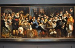
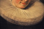
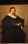
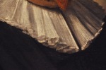
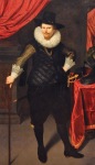
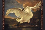
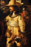
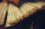
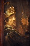
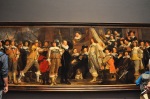
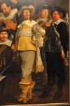
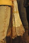
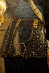
OK, off to the good stuff!  Let’s start with one of the highlights of the museum – one of the most famous Dutch Golden Age paintings from the greatest portrait artist of the time, Rembrandt van Rijn’s Night Watch, 1642.  It’s sufficiently important to have its own room, and it’s placed just so; the painting is at the visual center at the end of the hall in this picture.  The Night Watch is a group portrait of the city’s civic guard getting ready to move out.  Until this painting, group portraits showed people sitting or standing stiffly.  Not here!  The picture is an action shot; motion is everywhere.  Furthermore, details of the

guards’ attire are stunning.  Look at the uniform of the dude in the light outfit!  He’s depicted in such exquisite detail, with a strong 3-D component, that you would hardly be surprised if he walked out of the painting.  And, of course, there’s a selfie that Rembrandt incorporated at the left edge.  Cute!

Below is another civic guard painting, Militia Company of District VIII under the Command of Captain Roelof Bicker, 1643, this one by Bartholomeus van der Helst, one of

the leading portrait painters of the Dutch Golden Age.  Like Rembrandt’s painting, it’s huge, filling an entire wall (and including a selfie at the far left, as well).  And like Rembrandt’s painting, it’s gorgeous.

There are soooooooooooo many Rembrandts here!  The good news is that it’s not possible to be bored by them.  Here’s a sampling, starting with the young Rembrandt.  This first

one is Tobit and Anna with the Kid, 1626.  The story is that Tobit is blind, condemning him (and wife Anna) to grinding poverty.  When Anna comes home with a goat, a reward for hard work, Tobit thinks she stole it and prays for his quick death.

The first painting below is Rembrandt’s Musical Company, 1626, followed by his Self-

portrait, 1628.  For Self-portrait, even at just 22 years of age he’s experimenting, with the light interestingly just glancing along his cheek, the rest of his face veiled in shadow.  The curls of his hair were made by scratching the wet canvas with the butt end of his brush.

This next Rembrandt is An Old Woman reading, Probably the Prophetess Hannah, 1631

(according to the Gospel of Luke, Hannah was an elderly lady who worshiped God day and night).  It’s amazing.  Look at that wrinkled hand!

Rembrandt painted only a few landscapes – here’s one of them, Landscape with a Stone

Bridge, 1638.  It’s pretty cool, with the dramatic sunlight contrasting with the approaching storm.

We’ll finish this Rembrandt section with some of his later paintings.  We’ll call these next two paintings ‘family portraits’; the first is Rembrandt’s Son Titus in a Monk’s Habit, from 1660, and Self-portrait as the Apostle Paul from ’61 (it was common during this time to

portray people as historical personages).  Another later painting is historical, The Conspiracy of the Batavians under Claudius Civilis, 1661, depicting the one-eyed Batavian

chieftain entering a treaty to overthrow the Romans (69 AD).  The picture below is The Wardens of the Amsterdam Drapers’ Guild, Known as ‘The Syndics’, 1662.  The syndics inspected the quality of dyed cloth, and here Rembrandt enlivened the scene by

portraying them looking up from their work as though disturbed by our arrival, a clever artistic device attesting to Rembrandt’s creativity even in his later works.

Our last Rembrandt is Isaac and Rebecca, Known as ‘The Jewish Bride’, 1665 .  Note how this painting glitters, helped by the use of a palette knife and by painting reflections off the jewelry.


Leaving Rembrandt (alas!), below is a quick look at more Dutch landscapes.  The first painting is River Landscape with Ferry by Salomon van Ruysdael, 1649.  van Ruysdael

was famous for his pictures of the flat, watery Dutch landscape; here the small ferry contains 4 horses, 5 dogs, 2 cows and 11 people – yikes!  Must be rush hour, as the other boats are fully loaded as well.  The two paintings to the right are The Entrance to the Woods by Philips Koninck, 1665 and A Watermill by Meindert Hobbema, 1664.  Hobbema studied under Jacob Isaacksz van Ruisdael, the pre-eminent landscape painter of the Dutch Golden Age, represented by the underlying two pictures, Landscape with Waterfall, 1668.

We’ll move on to Jan Havicksz Steen, known for his paintings of daily life – often involving a tavern (his parents owned a tavern, and at times he himself owned a brewery and a tavern); he’s also known for his sense of humor and psychological insights.  The paintings are a delight!!  His scenes often depict lusty life that approaches chaos, so much so that a Dutch proverb, “a Jan Steen household”, meant a chaotic surrounding.  So let’s see some of these paintings!  The first is The Merry Family, 1668, depicting a family making LOTS of noise – and also drinking and smoking.  There’s a moral – the note hanging from

the mantel reads “As the old sing, so shall the young twitter”, suggesting less than ideal parenting (and presaging today’s internet?).  The next is The Drunken Couple, 1655.  After a night of revelry, the two individuals are so drunk they don’t realize they’re being robbed.  The owl print above them contains the moral; considered a stupid bird in the 1600’s, the owl can’t see by day (even with the help of a candle).  The following picture is The Feast of St Nicholas, 1665, which captures the elements of this holiday; the little girl has a bucket of treats, while the naughty boy gets a bundle of twigs in his shoe.

Continuing with Steen, the first picture below is Interior with a Woman Feeding a Parrot, Known as ‘The Parrot Cage’, 1660.  The next painting is The Sick Woman, 1663.  Is the

weak young woman pregnant?  To test this, the old-fashion-attired doctor has put a strip of the woman’s clothing in a brazier to smoulder, the smell revealing her status; and the discredited technique identifying him as a quack.  The last painting is Adolf and Catharina Croeser, Known as ‘The Burgomaster of Delft and his Daughter’, 1655.  This is a portrait of a wealthy grain merchant sitting I think unattractively outside his house, where a poor woman and child beg him for alms.  A rather strange portrait!  Interestingly, 2 years later Mr. Croeser helped Steen deal with serious debt.

There’s a lot more of the Rijksmuseum to see, so I’ll have to do another post – or two?  I’ll close this one with two popular painters from the later Dutch Golden Age, Johannes Vermeer and Pieter de Hooch.  Who is Pieter de Hooch, you ask?  Both painters specialized in interior scenes of domestic middle-class life, both had a sophisticated treatment of light, and both were keen observers of life’s everyday details.  Vermeer was only modestly successful, dying in debt and historically ignored.  Rediscovered in the  1800’s, he is now acknowledged as one of the greatest Dutch Golden Age painters.  de Hooch, on the other hand, was more successful at the time, painting more and painting for wealthier patrons.  Both had slightly different strengths, but Vermeer had the better technique.  Let’s see them, starting with de Hooch.  The first painting is Woman with a Child in a Pantry, 1656.  de Hooch effectively creates interior space via doorways

and windows.  The other painting is A Mother Delousing her Child’s Hair, Known as ‘A Mother’s Duty’, 1658, and uses the same technique to create depth.

The first Vermeer painting below, View of Houses in Delft, Known as ‘The Little Street’, 1658, is not your typical Vermeer subject; although the two figures doing chores in this painting are perfectly framed by doors, as if by actual picture frames, the subject is

clearly the carefully rendered detail of the old buildings.  However, the next painting, The Love Letter, 1669, certainly is typical Vermeer with its domestic scene (in spite of its unusual vantage point).  In this picture, the seascape on the wall behind the two ladies alludes to the letter’s content – in the 1600’s, the sea was often compared to love, and the lover to a ship.  The last picture below, Vermeer’s The Milkmaid, 1660, is almost photographic, with glistening light on the crusty bread (and the milkmaid’s forehead).

The light gradations and the primary colors are treated with a virtuoso hand.  Bravo.

The next post continues our Rijksmuseum tour with Old Master paintings.  You’ll love them!


Amsterdam, the city

Amsterdam is not a city founded by Rome; Rome wanted nothing to do with those unhealthy, marshy lands. It wasn’t until 1200 AD that a small fishing village was built around a castle on a dam at the mouth of the Amstel river, called “Amstellredamme” – translation, dyke (dam) on the Amstel. With time it was a city built entirely by intelligent town planners working with rich traders. In the 1600’s, during the Dutch Golden Age, local merchants established the Dutch East India Company, which became the strongest trading organization in the world.  At its height it had 150 ships sailing the oceans escorted by 40 warships and an army of 10,000 men. Amsterdam became the leading port in the world (it’s still Europe’s fifth largest), and its riches led to greatness  It supported artists like Rembrandt and Vermeer. Van Leeuwenhoek invented the microscope here, and Boerhaave founded clinical teaching and the modern academic hospital. Its diamond cutters became world famous.  Amsterdam’s decline started in the 1700’s following wars with the other major sea power, England, and continued with Napoleon’s conquest, the World Wars, and Nazi occupation.

Today Amsterdam is known for its multi-cultural tolerance – including it’s early embrace of marijuana in coffee houses and it’s red-light district.  It has more than 60 miles of delightful canals that divide the city into about 90 islands linked by more than 1000 bridges, giving it some resemblance to Venice.  We’re here mostly for the museums, but first a peek at the city.

One of the first things to notice in this city is that bicycles and bicyclists are everywhere; everyone seems to commute by bike.  If bikes aren’t zinging past you, they’re parked in

row after row or head to toe on every available street or bridge.   Cars are outnumbered and do not rule the road; bikes do.  When biking in the US, I warily watch what a car is going to do, ready to react.  Here it’s the other way around; cars warily watch the bikers, who do just about anything they want.  And I must say, pedestrians also have to be wary about bicyclists; there’s definitely a pecking order, with bicyclists at the top.  Consider crossing the street – OK, jaywalking really, but it’s a common event.  Between the sidewalk and the road is a bike lane.  So you look down the road to see if a car is coming – but wait!  You’d better look down the bike path first, because there’s a lot more bike traffic and you’ll be flattened in an instant!   So you wait for the bike lane to clear, recheck the road, and start across the road.  HOWEVER, before getting off the road to the other side, there’s a bike lane to cross, with a lot of bike traffic.  So you stand in the road waiting for the bike traffic to clear so you can dash to the sidewalk.  Definitely trickier.

A distinctive feature of Amsterdam is its many buildings from the 1600’s.  During the height of the Dutch Golden Age, numerous canals were dug around Amsterdam for defense and transport purposes, and many wealthy merchants had new houses built along these canals.  These houses were generally very narrow with ornamental façades that

extolled the owner’s status.  In Amsterdam, stepped gables were a popular flourish.  These houses were both home and workplace, with attic and basement spaces to store goods like cotton or cocoa.  Hooks were affixed to the top of the narrow houses to hoist furniture and

goods up and through the windows, a tradition still employed today.  The buildings of Amsterdam are also often decorated with art, both old and contemporary.

OK, the comparison with Venice was a stretch, but still the many canals and bridges bestow on this city a delightfully pleasant and scenic tranquility, illustrated below.  That

last picture shows the Magere Brug drawbridge spanning the Amstel.  It’s the last of what were once hundreds of wooden bridges crossing the canals; its mechanisms are still worked by hand.

Let me show you some of Amsterdam’s more famous buildings, like the Nieuwe Kerk, or New Church.  Of course there is an Oude (old) Kerk that was a small chapel in 1306, 
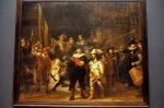
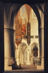
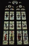
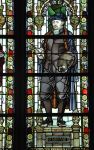
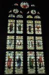
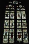
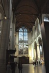
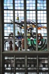
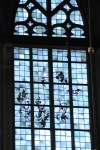
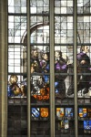
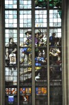
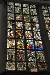
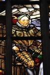
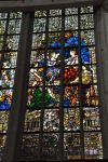
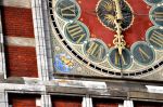
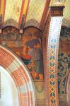
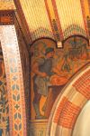
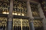
undergoing many alterations until its final form in the 1500’s, shown here (now used for non-religious purposes).  The Oude Kerk became too small to serve the expanding Amsterdam, so a new basilica was started about 1400, dividing Amsterdam into 2 parishes – and subsequently centuries of competition.  The Nieuwe Kerk was damaged by fires in 1452 and restored to its final late Gothic structure, shown in the pictures below.

The interior of the Nieuwe Kerk is lit by 75 windows, a few shown here.

Nearby is the Royal Palace, originally built in the mid 1600’s as a town hall in keeping

with the power and prestige of Europe’s commercial capital (it required 13,659 piles in the marshy ground to support it).  When completed it was the largest and most expensive town hall in Europe.  In the 1800’s, Napoleon’s brother crowned himself King of the Netherlands and transformed the building into a royal residence.

Amsterdam’s Central Station is not really old – it was built in the late 1800’s – but it is gorgeous.  Built on 3 artificial islands facing the port, and 8,687 piles, this huge building

had to be a challenge to build.  Pictures of the exterior are shown above; the interior is no less  impressive, examples shown below.

Even the boarding area is attractive, particularly the metal art.

Well, there’s certainly a lot more to see, such as this basilica (Church of St Nicholas) – and 
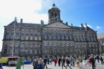
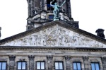
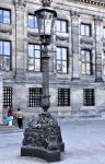
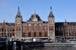
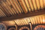
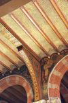
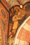
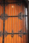
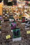
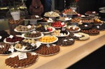
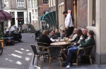
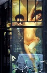
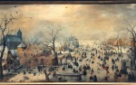
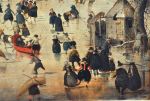
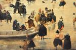
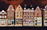
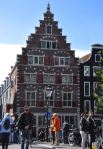
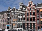
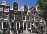
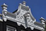
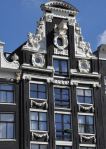
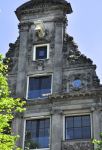
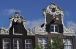
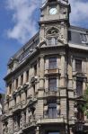
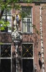
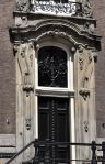
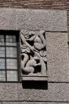
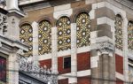
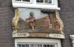
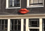
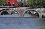
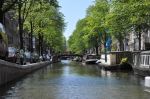
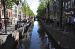
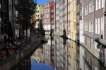
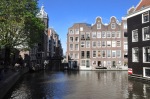
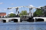
let’s not forget the red-light district (where photos are not encouraged) – but let’s close this post with a quick look at Amsterdam’s ambiance, which is quite delightful. The ubiquitous canals and bridges of this large city divide it into domains that give it a small-town feel that’s palpable.  And yes, there are touristy shops around – flowers, bulbs, china, wooden shoes – but they feel like part of the town rather than a tourist mecca.  I hope the pictures below give you that feel.

Ah, humor me for one last topic before closing this post.  The (very liberal) Amsterdam does not shy from using the (poorly clothed) human form in its advertising, which to this American is always a bit shocking, followed by my introspective amusement at my being shocked, followed by my appreciation of the often clever tongue-in-cheek thought behind

the advertisement.  For example, the window advertisement in the first picture above, advertising stylish men’s clothes, is a clear reference to classical art showing men that are – ah – sweeping women off their feet (I’ve added an example of classical art in the next  picture).  I can’t imagine the outcry in the US with such advertising, but I do think there’s a sly cleverness to be enjoyed.

We enjoyed Amsterdam the city, but the real reason to visit is its museums.  Next post – the Rijksmuseum.