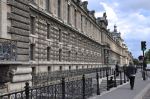
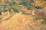
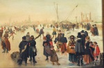
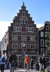
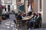
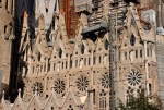
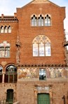
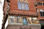
The Gothic Quarter of Barcelona, the Barri Gòtic, was the center of the Roman city of Barcino and, subsequently, of medieval Barcelona; it’s still the site of several government buildings, including City Hall. Once confined by city walls, its maze of narrow streets periodically open out onto secluded squares ringed with delightful cafes and boutiques. Happily, much of the Barri Gòtic (“El Gòtic”) – an extensive area – is closed to regular traffic, making it a haven for pedestrians. However, although several buildings date from medieval times, most of the Barri Gòtic was rebuilt in the late 1800’s and early 1900’s when it underwent massive restoration projects for the 1888 Universal Exposition (international fair) and the 1929 International Exhibition.
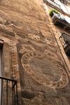
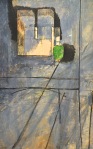
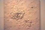
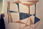
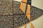
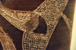
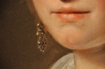
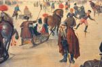
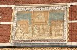
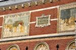
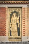
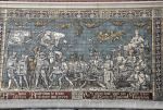
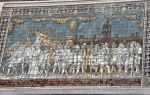
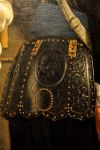
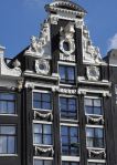
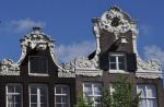
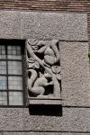
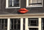
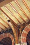
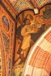
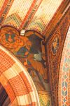
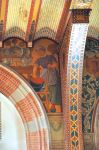
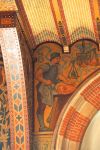
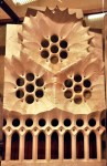
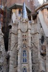
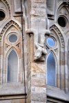
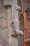
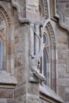
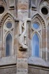
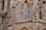
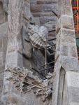
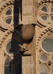
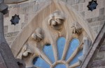
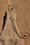
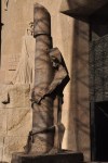
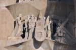
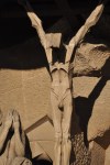
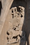
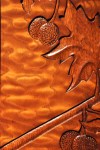
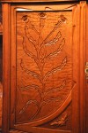
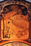
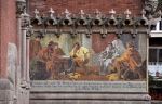
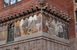
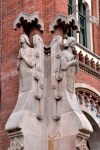
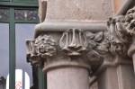
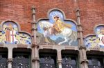
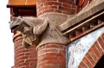
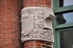
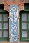
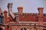
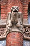
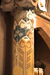
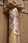
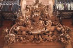
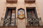
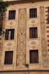
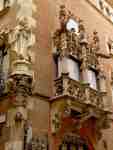
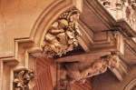
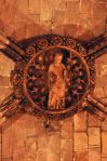
We’ve seen some of the west edge of El Gòtic when we did side excursions from La Rambla (post Barcelona V); we visited the Temple of Augustus, the church Santa Maria del Pi, and the plaza La Placa Reial. In this post we will pretty much walk down the middle of El Gòtic, enjoying fanciful ironwork on its balconies, painted tiles, sgraffito and sculpted
wall decorations (examples above).
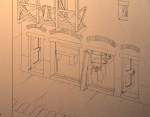
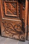
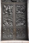
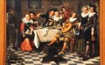
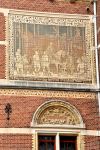
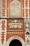
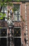
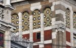
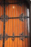
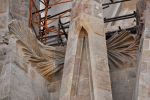
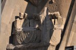
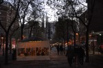
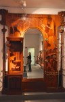
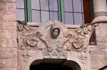
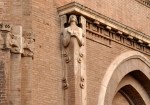
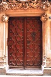
Starting from the elegant main Barcelona plaza (the Placa de Catalunya), we’re taking the road Portal de L’Angel into the heart of the El Gòtic, and the pictures shown above are from the early part of that road. Our first stop is the cafe Els Quatre Gats (The Four Cats, derived from a Catalan expression referring to people who are outsiders or a bit strange). Time for some history! Señor Pe Romeu had worked in a French cafe and decided to open one just like it in Barcelona. He had 3 backers who were major modernist Spanish artists, among them the painter Ramon Casas. In 1897 Els Quatre Gats opened in a modernist building designed by Josep Puig i Cadafalch (you met him in the Barcelona I post). The owners wanted the cafe to be known for its good and inexpensive food, but also for its “food of the spirit,” a place of music and ambiance where artists could meet to discuss their work or news of the day. The cafe quickly became a popular haunt for artists (and architects, such as Gaudí). It hosted performances, concerts, art exhibitions and literary gatherings. The 17-year-old Pablo Picasso frequented the cafe and held his first solo exhibition in the main room. So let’s see El Quatre Gats! The exterior is pretty impressive, with Hobbit-like doors and windows and stone carvings everywhere.
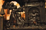
Picasso himself made a poster advertising the cafe, shown below, and inside the cafe hangs a large painting of Ramon Casas and Pe Romeu on a bicycle (the painting by Casas).
Unfortunately Romeu was not a businessman, allowing tabs to go uncollected, and Els 4 Gats went out of business in 1903. It wasn’t until 1978 that the famous cafe was again reopened to the public; shown below are pictures of the interior of the restaurant as seen today.
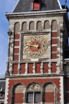
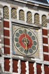
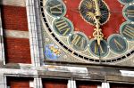
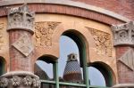
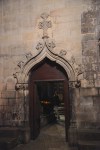
Further down we come to the plaza Placa Nova and two Roman towers flanking the main street, shown in the first picture below. The towers once guarded the entrance gate to
Barcino. Although much has been reconstructed, the big stones at the base are original. Before going down that narrow street between the two Roman towers, if we were to look above the wall of buildings to the left of that first picture above, we would see the towering Barcelona Cathedral, shown below. Let’s go see it! Walking down that narrow street into the heart of El Gòtic, we pass underneath the attractive Carrer el Bisbe bridge that connects Catalan government buildings, shown below. Although it looks old, it’s only from
the 1920’s.
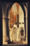
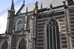
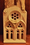
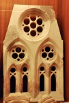
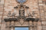
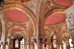
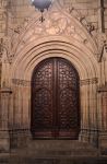
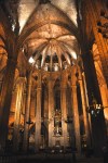
The area where the Cathedral now stands has been a center of worship since the 300’s, but the Barcelona Cathedral (real name: Cathedral of the Holy Cross and Saint Eulali) dates from the 1300’s. The facade was added in the late 1800’s in Neo-Gothic style called
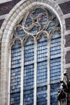
“French Flamboyant”. It’s not the most impressive cathedral, but it does have some gorgeous medieval artwork. We visited it in the evening, so lighting was a bit dim. We entered directly into the cloister, which was completed in 1448. Its courtyard is startling – rather than your manicured, mostly open formal-garden-like courtyard, this one is
practically a dense lush forest, with tall trees (including palm trees) and a fish pond/fountain that you can dimly see above. Pictures of the cloister and some interesting doors are shown below.
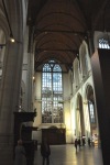
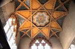
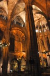
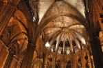
It’s hard to capture the layout of the cathedral interior. The vaulted ceiling covers 5 aisles, but the outermost two aisles are not passageways; they’re divided into 28 chapels. Interestingly, these chapels function not only as places of worship but also as interior buttresses supporting the roof (note the absence of typical Gothic buttresses on the external walls in the picture of the Cathedral facade above). Below are pictures of one of the aisles and a view back to the Cathedral entrance. It does have a rough charm to it.
Views to the alter are shown below, with its 9 radiating chapels.
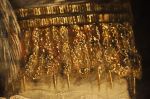
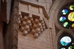
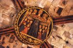
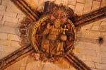
The decoration covering the point where ceiling vault ribs join is called a “boss”, and the bosses here are intricate and gorgeous, some examples shown below (they’re also hard to photograph with a hand-held camera, in dim light, upside down!).
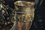
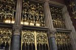
The ornately carved choir is impressive, with the choir stalls retaining the coats-of-arms of Charles V’s knights of the Order of the Golden Fleece, from 1519. The nearby organ (1538)
and other details are pretty spiffy.
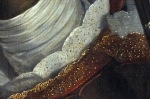
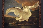
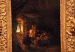
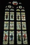
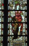
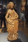
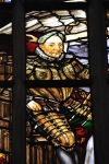
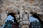
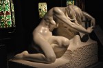
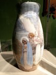
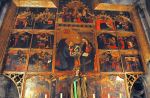
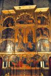
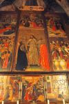
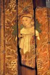
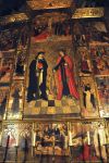
 Now to the good stuff, the art in the many chapels. There are 28 chapels, so I’m not going to show you all of them! Besides, many of these chapels feature very large, busy, gilded, ornately carved alterpieces, such as that shown to the left. They’re not my favorite; over-the-top exuberance can just be too much. I prefer the old medieval paintings, with their fledgling relearning of perspective, patterned gold, beatific faces, and gorgeously painted vestments. I hope you like them too, because I’m going to show a bunch of them!
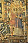
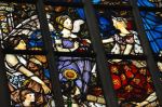
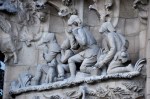
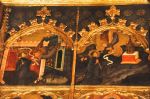
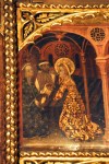
Below are pictures decorating the Alterpiece of St. Gabriel the Archangel, painted in 1390.
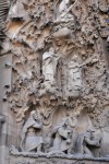
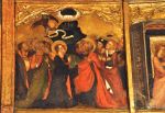
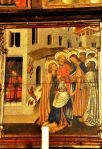
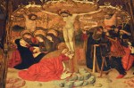
I love the general lack of perspective, which wasn’t introduced in medieval painting for another couple of decades. And Christ ascending into heaven in the next-to-last picture – there go his feet! Another impressive alterpiece is The Alterpiece of Bartholomew and St. Elisabeth, from 1401, shown below.
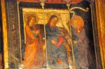
I think it’s beautiful, as is the Alterpiece of the Transformation of San Benito from about 1450, below, that the Cathedral considers one of its more important Gothic pieces. The
artist is Bernat Martorell, who did some really cool stuff (eg, see his painting “Saint George Killing the Dragon”, at the Art Institute of Chicago, at this link:
https://www.artic.edu/artworks/15468/saint-george-and-the-dragon
Another impressive alterpiece is The Alterpiece of St. Clair and St. Catherine, from about 1456, shown below.
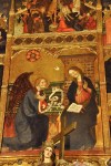
Increasingly sophisticated technique is shown in The Visitation, showing St. Luke and St.
Sebastian, painted around 1470. Lastly I’ll show the Alterpiece of St. Sebastian and St. Tecla, from around 1490. The paintings are great, as shown below. It’s always a treat to see art in the space for which it was designed.
OK! We’re done with alterpieces! Hope you enjoyed them. The Cathedral is a veritable museum.
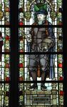
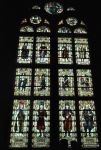
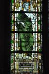
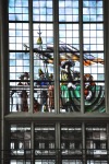
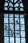
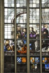
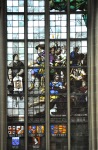
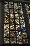
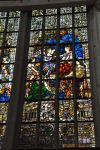
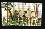
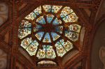
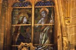
Below are a few more treasures to show off: a chapel with some gorgeous frescos, a baptismal from 1433, and a stained glass window, small and high up, from 1495, – and I think impressive for its time.
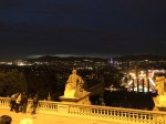
We’ll end our visit to Barcelona’s Cathedral with a view of the facade at night. And with all that walking, how about a tapa or two?
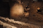
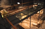
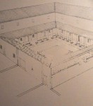
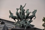
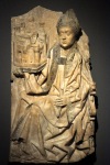
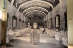
At the start of this post I mentioned that the Barri Gòtic was the center of the Roman city Barcino, so you might guess there are Roman ruins here. Yep, and they’re pretty cool. In an earlier post you saw the ruins of the Temple d’August (Barcelona V: La Rambla). Well, there’s a lot more, thanks to a city renovation that relocated a 1400’s gothic palace to a plaza near the Cathedral, the Placa del Rei, where ruins from a large section of Barcino were discovered underground. The museum (Museu D’Historia de Barcelona) is centered on the Palau Reial Major (the Grand Royal Palace, shown below) that consists of 3 edifices from 1302, 1360, and 1549. The picture on the right is the Palace’s main hall, built in 1360, the arches founded over vaults from the 11th century (which were built over a
monumental structure dating from the Visgoths’ rule [5th to 8th century]). Interesting in its own right, over time the Palace was the residence of the counts of Barcelona, the Kings of Aragon, site of the Inquistion, and the royal administration.
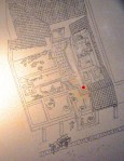
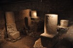
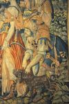
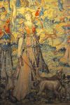
Just for overview, I’ll start with representations of Barcino, shown below. The excavated
ruins beneath the Placa del Rei date from the 1st to the 6th century and include an extensive area of workshops and an “episcopal ensemble”, the bishop’s residence and other buildings devoted to Christian worship (me – showing a remarkable transformation from paganism to Christianity within 200 years). We’ll visit a piece of the city wall, ruins of a laundry and a dyeing workshop, a factory for salting fish and making fish sauces like garum, an important wine business, and some of the episcopal ensemble.
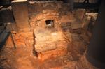
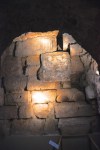
We’ll start with the inside face of the city wall, from 15-10 BC; originally 26 feet high, what we’re dealing with here are short sections and foundations, but they are the unaltered real
deal. The last picture above shows the interior of one of the 78 towers that was built on the outside of the wall; notice the extensive use of recycled material.
Although we’re seeing just short walls and foundations, they’re still pretty revealing, as you’ll see subsequently. The picture here shows a wall, a door, and a sewer.
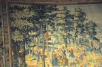
The workers’ homes and shops opened to a street, as shown below in the schematic visualizations. In the last picture, the street had a portico for pedestrians and led from
the city wall to the forum. The stone structure in the front is a sewer, reformed in the 3oo’s.
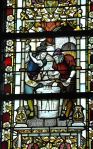
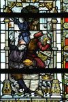
The following workshops are essentially small factories! We’ll start with the laundry and dye shops from the early 100’s. The drains and vats contained preserved colorants, lime
and starch for bleaching and sizing, and ashes and ammonia for detergents. Note: the Romans were not acquainted with soap, and used instead different kinds of alkali. The most common ingredient was the urine of men and animals, mixed with the water in which the clothes were washed. The urine was typically supplied by vessels placed at the corners of streets, filled by passers-by. We’ve come a long way, baby.
Nearby was a factory from the 200’s for salting fish and making fish sauces like garum. Garum in particular was very popular in Roman times, made by macerating fish offal in
salt, sometimes adding anchovies, oysters, or other shellfish. We mentioned it before in a (much) earlier post (Malaga, Costa del Sol).
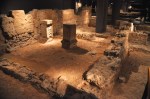
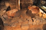
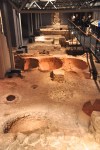
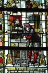
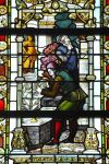
Most impressive is an extensive wine-making facility, used from around 250 AD into the 300’s. There were several vats for settling and pressing the grapes, transfer ducts for the
must (using gravity flow), and vats for fermentation of the must. Subsequently the wine was processed and aged within dolia in the cellar, where honey and sea salt were added.
The two smaller vessels embedded in the floor in the pictures above were used to hold the honey and salt.
Also preserved in this Roman area is part of the peristylum (porticoed garden) of an important Roman house – probably the proprietor of the winery and garum factory.
The house is important because in the AD 300’s its owner gave part of his property to the emerging church, making it possible to build a basilica and baptistry in 343 AD. In the AD 400’s with the increasing power of the bishops, an episcopal palace and hall were built (the city had been conquered by the Visigoths, but they tolerated the practice of Catholicism). In the 500’s a cruciform church was built within the “episcopal ensemble”,
leading eventually to today’s Cathedral.
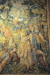
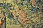
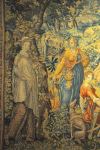
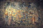
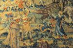
Some of the Roman art found in these ruins is impressive for this part of the woods.
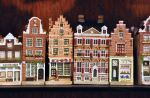
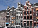
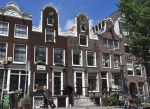
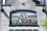
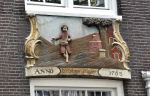
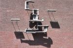
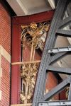
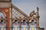
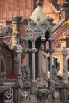
Finally I’ll end this oh-so-long post with a walk through El Gòtic just looking at the interesting art on the buildings and the small medieval streets. It’s an interesting area of this city, and I hope you enjoyed it!
Next post – Hospital de la Santa Creu i Sant Pau (Hospital of the Holy Cross and of Saint Paul), designed by Lluis Domenech i Montaner and considered to be one of the best Art Nouveau complexes in the world. You’ll be impressed.
 We of course have been to Paris before – and loved it. It’s such a wonderful city, with its beautiful buildings and parks and inviting bistros, and of course the food. Why not spend a few days there? And see more Impressionist paintings? And meet a friend who will join us there? Oh yeah.


 French cuisine, there is much to say of French wine. It’s truly classic. Although tastes may have evolved in some of us, those of a certain age tip their hats to the French. They elevated wine to an art form, and taught the world its pleasures. I’ll only note that in France, even the homeless need 2 bottles with dinner.


")


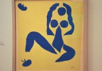
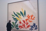
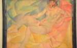
 - Blue Harmony, Gray Harmony, Ochre Harmony; by Henri Matisse, 1930")
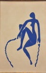
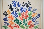
); by Henri Matisse, 1938")


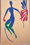

 This last piece, to the left, was done the year of his death (1954). It’s again a design for the cover of the journal Verve; Matisse did a number of covers for them. The Fauvist tendencies are still there, and still interesting.


 I’ll end with a later, cute work by William Copley, Lady Chatterley’s Horse, from 1960.


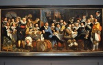


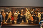
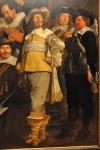
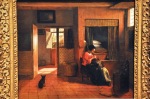
 OK, off to the good stuff! Let’s start with one of the highlights of the museum – one of the most famous Dutch Golden Age paintings from the greatest portrait artist of the time, Rembrandt van Rijn’s Night Watch, 1642. It’s sufficiently important to have its own room, and it’s placed just so; the painting is at the visual center at the end of the hall in this picture. The Night Watch is a group portrait of the city’s civic guard getting ready to move out. Until this painting, group portraits showed people sitting or standing stiffly. Not here! The picture is an action shot; motion is everywhere. Furthermore, details of the
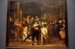


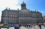
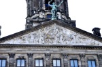
 undergoing many alterations until its final form in the 1500’s, shown here (now used for non-religious purposes). The Oude Kerk became too small to serve the expanding Amsterdam, so a new basilica was started about 1400, dividing Amsterdam into 2 parishes – and subsequently centuries of competition. The Nieuwe Kerk was damaged by fires in 1452 and restored to its final late Gothic structure, shown in the pictures below.
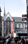

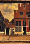
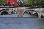
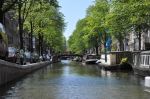
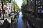
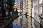
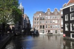
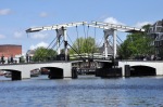
 let’s not forget the red-light district (where photos are not encouraged) – but let’s close this post with a quick look at Amsterdam’s ambiance, which is quite delightful. The ubiquitous canals and bridges of this large city divide it into domains that give it a small-town feel that’s palpable. And yes, there are touristy shops around – flowers, bulbs, china, wooden shoes – but they feel like part of the town rather than a tourist mecca. I hope the pictures below give you that feel.


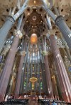
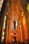
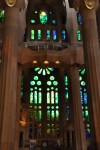
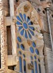
 With that preparation, let me introduce you to the interior. To the left is the floor plan of the Sagrada Família with the Nativity entrance on the right side. Following my visit to the Sagrada interior, I was very much surprised by this floor plan. Usually medieval cathedrals are cross-shaped with long and narrow naves and transepts. The Sagrada also incorporates a cross shape, but it looks positively short and squat, with truncated nave. The dwarf cathedral! However, inside the Sagrada, Gaudí’s “forest of columns” absolutely hides that wide and short nave; the columns define a long and narrow space very much like the Medieval cathedral. Besides, as you’ll see, with everything else that’s happening, the nave’s length is the last thing that’ll capture your attention!

")


 position in the history of architecture is that of a creative genius who, inspired by nature, developed a style of his own. His methods continue to be considered revolutionary, a century after he devised them (!). The Sagrada Família was and still is a constructional challenge: it is one of the largest testing grounds for construction methods in the world. Describing Sagrada Família, art critic Rainer Zerbst said “it is probably impossible to find a church building anything like it in the entire history of art”. Yep.


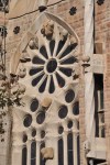
 to create balanced and self-supporting structures. Nature often incorporates in its structures such geometrical forms as the ellipse, parabola and hyperbola, and Gaudí adapted these and – when using two together – their intersections to be integral structural forms of his architecture. An example of Gaudí copying from nature is shown below, comparing the structure of a plant pollen grain to windows in the Sagrada.


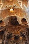
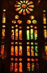
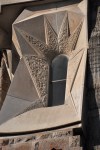
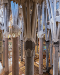
 time it was used only in the construction of suspension bridges; Gaudí was the first to use it in common architecture. He would attach a drawing of the building floor plan to a ceiling, from which he would attach strings (representing columns, arches, walls and vaults) with bags of birdshot (for the weight of small building parts). He would then take a picture that, when inverted, showed the structure for columns and arches that he was looking for. Using this technique, Gaudí arrived at the revolutionary idea of using inclined columns that subsequently branched out like trees. The leaning columns better resist the perpendicular pressure that they experience, and the branches support a structure of intertwined hyperboloid vaults. Space is divided into small, independent and self-supporting modules without needing the buttresses required with the neo-Gothic style. Further, the hyperboloid vaults have an empty center, allowing natural light to enter, in
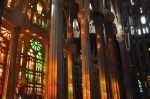
  contrast to Gothic vaults with their keystones that resulted in closed, dark cathedrals. Where Gothic vaults have ribs, the hyperboloid design allows the intersection between vaults to have holes, which Gaudí employed to give the impression of a starry sky. Further, Gaudí conceived the branching columns of the church to have not only a structural function but to represent a forest, a natural temple that invites prayer; and like sunlight filtering through leaves, to create a space of magical lighting conducive to intimacy and meditation. Isn’t that picture on the left gorgeous? Wait ’til you see the Gaudí interior!


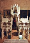
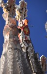
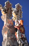
 First of all, just look at the model to the left, and be amazed. That’s a church? At this scale it almost looks like a Disney fairyland castle run amok. However, up close, surrounded by the cathedral’s details, the structure is overwhelmingly, undeniably religious.


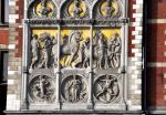
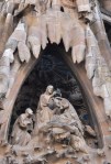
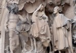
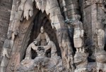
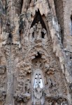
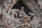
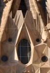
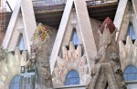
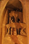
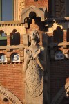
 niche, visible in the last two pictures above, Christ triumphantly crowning Mary. Starting at the bottom of the Nativity facade – you might find it helpful to refer back to the right 2 pictures above – this facade has 3 separate entrances each nestled inside a grand parabola (or portico), each portico representing one of the theological virtues of Hope, Faith and Charity. Two massive columns flanking the central portico rest either on a turtle or a tortoise, representing dominion over land and sea. The central and largest portico, Charity, has fabulous bronze double doors inspired by nature, full of metal leaves, flowers and insects, as shown below; perhaps suggesting that you are about to enter Gaudí’s reverential forest (of columns) mentioned earlier. Note that the statuary surrounding the doors (the Adoration


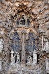
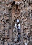
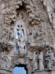
 depiction of the Annunciation, with the Archangel Gabriel announcing to Mary that she will be the mother of the Son of God. Finally, much higher than all of these decorations and at the apex of the Charity portico’s parabola is the beginning of a spire, the Tree of Life, which at its base opens out to form a large and commanding niche showing Jesus Christ crowning Mary as Queen of Heaven, as shown below. Interestingly, Joseph is present in this Coronation scene – an


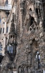

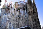


 The left side of the Nativity facade is – or will be – the main entrance, the Glory facade. It will be the largest and most striking of the facades. Alas, it’s under major construction and not much to see now. Ultimately the facade will represent how the soul navigates Death and the Final Judgment, avoids the pitfalls of Hell, and finds the eternal glory of God. Expect the Seven Deadly Sins, the Seven Heavenly Virtues, demons, idols, purgatory, etc.
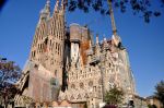


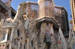


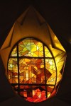
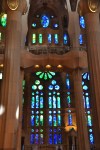
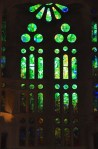
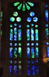
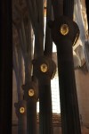
 That covers what we could see of this fascinating basilica from the outside. It’s amazing, yes? Designed in the early 1900’s but avant-garde even today. Gaudí was amazing. And really you haven’t seen anything yet! The interior is the mouth-gaping OMG part. My intention was to also show off the Sagrada interior in this post, but due to my enthusiasm the post is already too looooong! So you’ll have to wait to be blown away. The next post will be the Sagrada interior; the picture to the left is just a small taste of what’s to come. Don’t miss it!


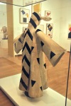
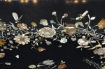
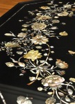
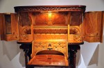
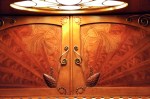
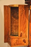
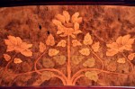
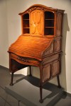
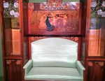
 This small museum is dedicated exclusively to Catalan Art Nouveau (or Modernista) from the late 1800’s and early 1900’s. It’s located in the Eixample neighborhood (
 These furniture makers took art and function to a new level. As an example, the picture on the left shows an umbrella stand (!). It’s different, functional and beautiful.


")


 Expo). In truth, part of the reason we spent less time here was an incident involving Barcelona’s high-crime gypsy population. I’ll tell the story in hopes that readers who travel might be better prepared. Walking up the subway stairs that lead to the street in front of the Palau Nacional, 3 Romanians tried to steal my camera which (I thought) was hidden in an outer compartment of my backpack. The theft was well-planned. With the 3 walking more-or-less abreast right behind me, the middle guy unzipped the compartment holding my camera (without me noticing). His plan was to yank out the camera and run down the stairs toward the subway, where the passageway splits into different tunnels. I would instantly notice the change in weight, if nothing else, turn to catch the guy, and bump into the remaining two “innocent” guys right behind me. What saved me was Ginger lagging behind on the steps, seeing the middle guy unzipping my bag, and screaming for the police. I whirled and grabbed the middle guy, the other two running up the steps. I asked Ginger if this was the guy (I didn’t know exactly what was going on, and he wasn’t protesting), but suddenly he whirled out of my grasp and ran down the (marble) steps. So I tried to tackle him on the steps, from above, but either because my backpack shifted or he turned his shoulders, I was thrown off onto said steps, dislocating my shoulder. The (plainclothes) police were there almost instantly and caught the other two Romanians (beautiful Barcelona does have a big petty crime problem that they’re addressing). So the camera was fine, but we spent some time in a hospital and in a courtroom dealing with this issue. The point: I think we would not have been a target had the camera been in an interior compartment of the backpack.


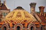
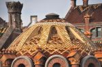
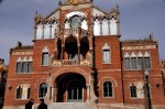
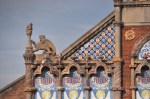
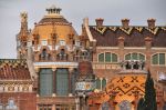
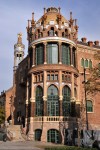
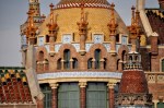
 The hospital complex that Montaner designed was a “city within a city”, isolated by interestingly turning the square hospital site 45° to the existing street plan of Barcelona. Clever! The ground plan of the hospital is centered on intersecting vertical and horizontal axes that create a cross, the emblem of the former Hospital de la Santa Creu. The individual pavilions are arranged symmetrically along the axes, each pavilion dedicated to a medical specialty (but linked together via underground pedestrian galleries that are pretty spiffy, as shown below).


")